Discover the story of E.Wedel’s first logo - a symbol of heritage and sweet excellence
Logos are more than just symbols — they are the visual embodiment of a brand’s identity, philosophy, and legacy. For a company like E.Wedel, one of Poland’s oldest and most beloved chocolate brands, the logo carries not only aesthetic value but also a deep historical and cultural significance.
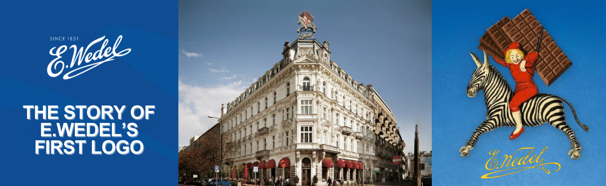
Today, E.Wedel is recognized by its elegant script and iconic blue packaging, but few people know the full story behind its very first logo — the mark that launched a journey spanning over 170 years of chocolate craftsmanship. Let’s take a trip back in time and discover how E.Wedel’s original logo came to life, how it evolved, and how a striped animal and a chocolate-loving boy became unexpected, yet enduring faces of the brand.
The origins of a chocolate legend
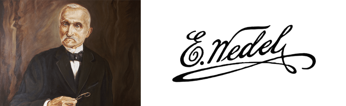
To understand the logo, we must first understand the man behind the name — Karol Ernest Wedel, a German-born confectioner who arrived in Warsaw in the early 1850s. With a passion for sweets and an entrepreneurial spirit, he opened a confectionery shop and small factory in 1851. His chocolate quickly gained popularity among the Warsaw elite, celebrated for its quality and flavor.
As demand grew, Karol realized he needed a mark that would distinguish his products and communicate their authenticity. Thus was born the idea of branding — and with it, the first E.Wedel logo.
A Signature of trust and authenticity
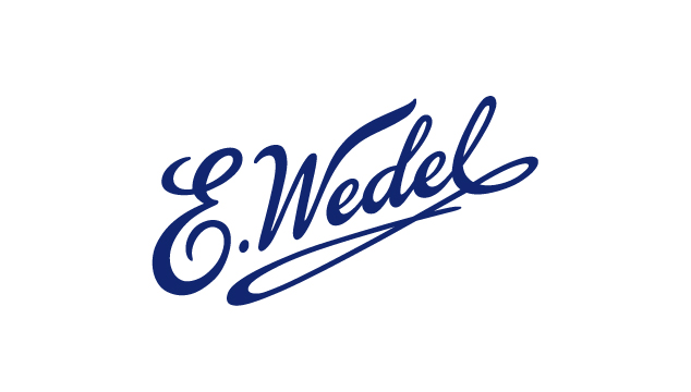
Unlike many companies of the 19th century that relied on decorative crests or formal emblems, E.Wedel’s first logo took a more personal and innovative approach: Karol Wedel’s handwritten signature. The original logo was simply his name, “E. Wedel”, written in flowing cursive. The “E” stood for “Ernest,” his middle name, and the name he used professionally. This handwritten style was bold and unconventional for its time, yet it instantly gave the brand a personal, authentic touch. The signature became a seal of quality — a message that said, “I stand by every product I make.”
From handwritten name to iconic brand
The signature endured through generations, becoming synonymous with E.Wedel's commitment to excellence. When Karol’s son Emil took over the business in 1876, and later his grandson Jan Wedel in the early 20th century, they both preserved and refined the logo — slightly stylizing the script for consistency across packaging and advertising materials.
By the 1930s, E.Wedel had become a symbol of Polish innovation and elegance, and the brand was already exploring other visual motifs to complement the signature logo — which brings us to the boy with the zebra.
Enter the Boy and the Zebra: A bold move in visual branding
 In the 1920s and 1930s, advertising was rapidly evolving. Jan Wedel, a visionary in both chocolate-making and marketing, understood the power of visual storytelling. He wanted a new visual symbol to represent the brand — something whimsical, eye-catching, and unforgettable.
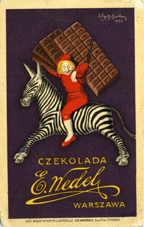
That’s when a collaboration was born between E.Wedel and Leonetto Cappiello, an Italian- French illustrator widely considered the father of modern advertising. Cappiello was known for his bold, colorful, and surreal posters. In 1926, Cappiello created what would become one of the most iconic images in Polish advertising history: a young boy in a navy blue sailor suit, joyfully riding a zebra while holding a giant chocolate bar. It was a stroke of genius.
What the Zebra represents
The poster felt surreal, humorous, and remarkably modern for its time. The zebra, a rare and exotic animal, symbolized something unique, surprising, and luxurious — much like the experience of tasting Wedel chocolate. The boy represented innocence, joy, and indulgence, making the image emotionally resonant for families and children.
This visual identity didn’t replace the signature logo, but it became a powerful companion to it — especially in print advertising, posters, and packaging for products aimed at younger audiences.
Over the years, the “boy with the zebra” became one of the most beloved images in Polish pop culture. It is still recognized and used by the brand today, a testament to its enduring charm and effectiveness.
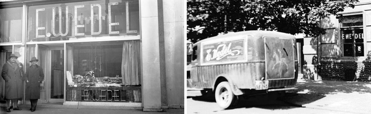
Through war and occupation: A symbol of resilience
World War II tested the endurance of Polish companies, and E.Wedel was no exception. Despite devastation, foreign occupation, and eventual nationalization under communist rule, the brand’s core visual elements — the signature and the zebra — survived. Even as E.Wedel was taken over by the state and operated under different regimes, the public continued to associate the brand with its original logo and the joyous image of the zebra boy. In times of hardship, it symbolized a link to happier, sweeter times.
Reinvention in the modern age
After the fall of communism and the brand’s privatization, E.Wedel went through several ownership changes, eventually becoming part of the South Korean Lotte Group. During this time, the company embarked on a mission to refresh the brand while honoring its heritage. Design teams updated the logo, refining the script and introducing a standardized blue as the primary brand color — known now as Wedel Blue. The boy and the zebra were also reintroduced in new advertising campaigns, often reimagined with modern aesthetics while maintaining their original charm.
The key to these updates was balance: preserving the emotional and historical essence of the brand while ensuring it remained relevant in a digital, global marketplace.
 The meaning behind the visual legacy
Today, E.Wedel’s visual identity is a layered story made up of:
● The elegant handwritten “E. Wedel” signature — a mark of trust and legacy
● The Wedel Blue, evoking calm, elegance, and quality
● The boy riding the zebra, a celebration of playfulness, tradition, and timeless joy
Together, these elements form a brand identity that bridges generations — speaking simultaneously to nostalgia and innovation.
From signature to symbol
The story of E.Wedel’s first logo — and the evolution of its visual identity — is not just a branding case study. It’s a story of vision, heritage, and emotional resonance. What began as a simple handwritten name turned into a visual language that has lasted for nearly two centuries.
And while trends in design come and go, the enduring success of the E.Wedel logo and the boy with the zebra proves one thing: when a brand connects deeply with people, its imagery becomes more than a marketing tool. It becomes a symbol of culture, memory, and timeless sweetness.